The Art and Science of Samples
Celeste Christie
I always tell my students in my Enameling classes to make samples. I have a very scientific approach, based in experimentation and careful notation. Want to know what this color really looks like? Make a sample! Want to know if you should fire this color at 1400 or 1600 degrees? Make a sample! Well, I guess I should follow my own advice...
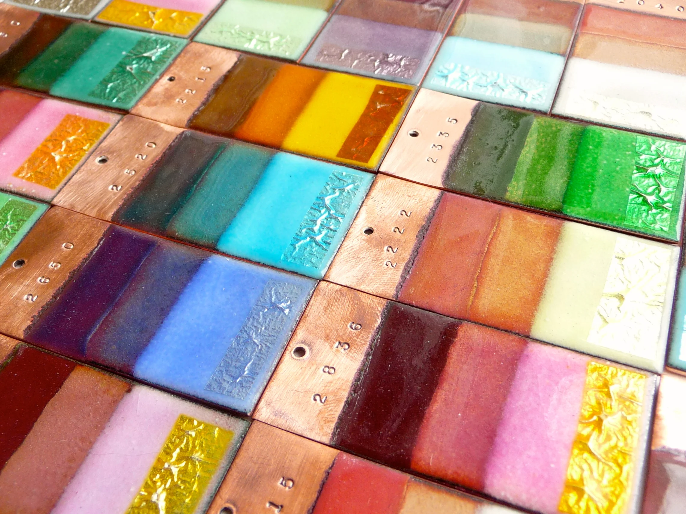
So I embarked on the mother of all samples - a sample board of every. single. color. I made samples of all of the Thompson's lead-free enamels. For the opaques, it was a simple counter enamel and then 2 coats on copper rectangles.
I went a little wild with the transparents. Above, you can see three examples. Each rectangle was coated first on the back and fired, and then I coated the bottom half with white enamel, then a strip of basic 2030 Clear Flux above that, and left the top part bare copper. After firing and cleaning the copper, I applied silver foil on top of the white enamel and then sifted the color over all of the piece. This shows you what the color looks like when fired directly on copper, on top of clear enamel, on top of white, and on silver. You can see that the 2838 reacts with the silver, creating a golden look to the silver foil, and that the colors show a muddy reddish cast over bare copper.
But I didn't stop there. I also wanted to see how the colors looked when fired hot, and also how the colors looked when fired over other clear enamels. In the picture on the left, I hot fired four colors at 1650F: 2650 Heron Blue, 2430 Beryl Green, 2510 Cascade Blue, and 2115 Mars Brown. As you can see, the hot firing results in a more iridescent effect. Colors in the yellow and light brown range often turn a lovely, almost metallic gold when fired hot. Greens and blues are often warmer, and paler colors like the Cascade Blue in the bottom left tend to become neutral.
On the right, I fired 4 colors: 2510 Cascade Blue, 2120 Otter Brown, 2835 Rose Pink, and 2310 Peppermint Green. Each is fired over 2015 Golden Clear on the top and 2020 Clear for Silver on the bottom. I wanted to see how the different tinted fluxes (enamelers call clear enamels flux) would create different shades.
One of the things I find fun about enameling is that colors can surprise you - a change in firing time, heat, or layering can bring about unexpected results. Since enamels can't be mixed the same way paints can, colors often need to be layered to produce different shades. These samples are not just beautiful works of art on their own (I want to wear them!), but they serve an essential purpose to me as an artist, giving me a reference guide to producing the colors I want to use. Of course, this won't take all of the surprise out of it - what would be the fun in that?


